flowchart TB
  A["Same observed difference<br/>Minneapolis: 18 per 1,000<br/>St. Paul: 9 per 1,000"]

  A --> B["Describe<br/>Minneapolis has the higher recorded rate"]
  A --> C["Compare<br/>+9 per 1,000<br/>2× as high"]
  A --> D["Explain<br/>Pollution? Housing? Access? Diagnosis?<br/>Several possibilities remain open"]
  A --> E["Claim cause<br/>Needs stronger design and evidence<br/>than the comparison alone provides"]
11 Correlation vs Causation
11.1 Everything Was Beautiful and Nothing Hurt: When Description Tries to Pass for Cause
One of the easiest ways to go wrong with data is not to miscalculate. It is to see a pattern, feel the pull of an explanation, and start talking as if the explanation has already been earned. Public health is especially vulnerable to that move because the stakes are high, the audience wants closure, and a clean story spreads faster than a careful one.
That is what people are really trying to say when they repeat that correlation does not imply causation. The sentence itself is fine. The problem is that it is easy to nod at it and then ignore it the moment an explanation feels plausible. The harder discipline is to keep separate four different things: what you observed, how large the difference is, which explanations remain possible, and what evidence would be needed before one of those explanations gets promoted to cause.
The vaccines-and-autism panic remains one of the clearest warnings. Vaccination and the early recognition of autism can occupy the same broad stretch of childhood, which makes the timeline emotionally easy to misread. A deeply flawed paper helped turn that overlap into a causal story, and the story survived long after the paper collapsed. That is the practical danger here. Once people decide the data must confirm what they already believe, they start treating an observed association as if it had already settled the mechanism underneath it. In public health, you do not get to do that.
One observed difference, several different kinds of sentences
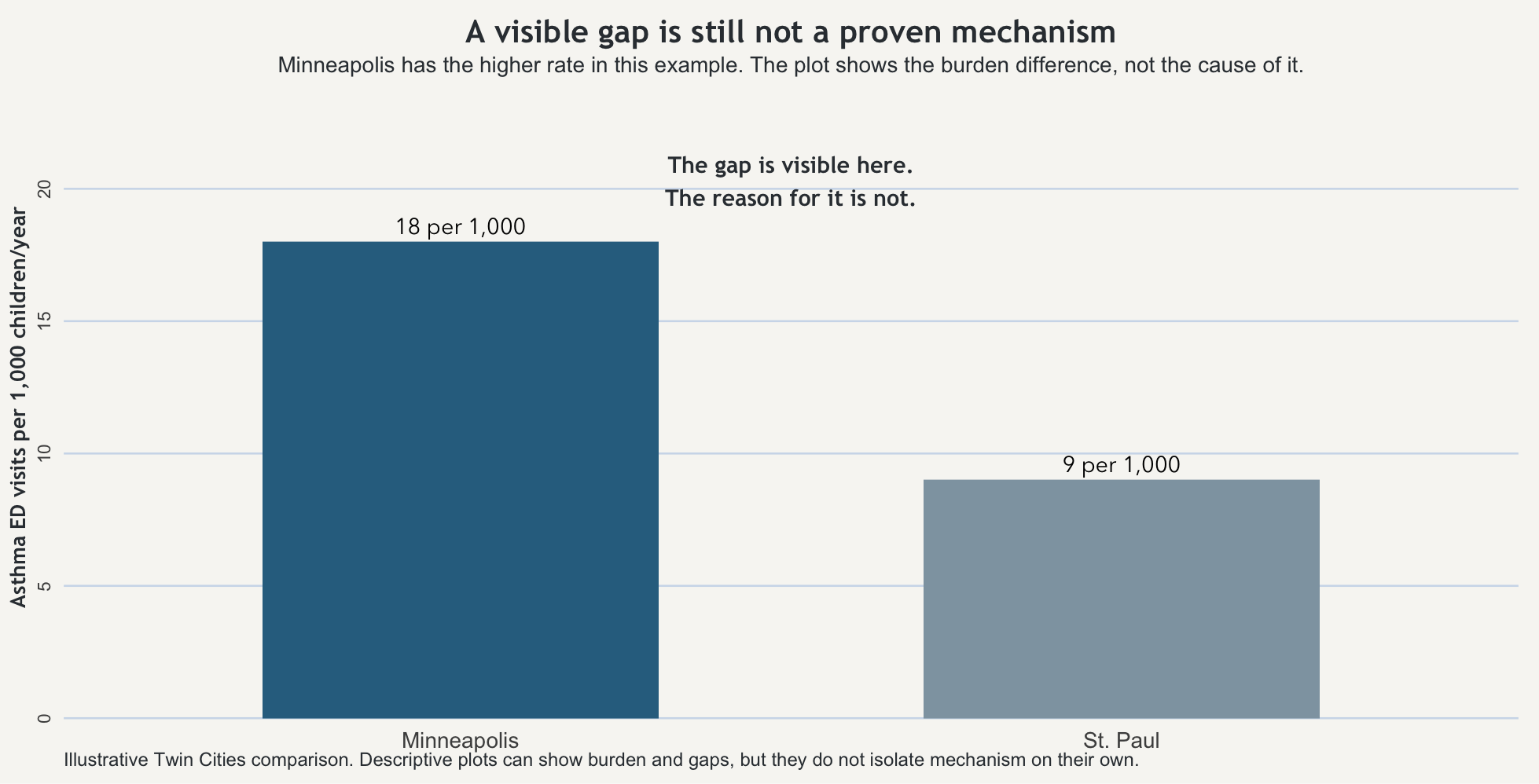
Start with one fixed example and keep it still. In one year, children in Minneapolis have 18 asthma-related emergency visits per 1,000 children. Children in St. Paul have 9 asthma-related emergency visits per 1,000 children. Nothing else changes. The outcome is the same, the population framing is the same, and the time window is the same. The observed difference is simple: Minneapolis shows the higher recorded rate.
That first sentence is description. Minneapolis has the higher measured asthma-related emergency visit rate. That already tells you something useful. It tells you where the burden appears heavier. It may tell you where monitoring, outreach, or clinical attention should begin. But it is still a descriptive statement.
The next step is comparison. Minneapolis is 9 visits per 1,000 children per year higher than St. Paul. It is also twice as high. Those are two mathematically correct ways to describe the same gap. They sharpen the difference. They do not explain it.
Then comes explanation. The higher rate in Minneapolis could reflect traffic-related air pollution, older housing, indoor allergens, differences in access to routine care, differences in how often asthma is diagnosed, or several of those at once. Those are plausible explanations. They may even be good explanations. But at this stage they are still candidate stories attached to an observed pattern.
A causal claim is a different kind of sentence again. “Air pollution is the reason Minneapolis has the higher asthma burden” might eventually turn out to be broadly right, partly right, or wrong. But that sentence requires more than the comparison alone can provide.
The reason people get tangled up here is that the same observed difference can support several kinds of sentences at once. It is easy to slide from one to the next without noticing that the evidentiary burden has changed. Once that slide happens, the explanation starts sounding like a fact the comparison itself has already proven.
Why one pattern can support more than one story
The Minneapolis–St. Paul gap can stay exactly the same while the underlying story changes. Suppose one city has more traffic exposure near major roads and also older housing stock. Suppose it also has more unstable access to primary care, which pushes families toward emergency departments when symptoms worsen. Suppose clinicians in one system diagnose asthma more aggressively than clinicians in the other. The measured difference could reflect one of those forces, several of them together, or a mix of environment and measurement.
That is what confounding feels like in practice. More than one thing can travel with a city, a neighborhood, a clinic, a school, or a household. The city label is standing in for a bundle of conditions, and the first plausible explanation is not automatically the right one just because it arrived quickly or fit somebody’s priors. The point is not to refuse explanation forever. The point is to resist pretending that an observed association has already isolated the mechanism.
What epidemiology asks before it says cause
This is where epidemiology becomes more disciplined than everyday storytelling. The classic formal framework is Bradford Hill’s nine viewpoints: strength, consistency, specificity, temporality, biological gradient, plausibility, coherence, experiment, and analogy. But they work better here as pressure questions than as a list to memorize or a checklist to score.
Applied to the Twin Cities example, the first pressure question is temporality: did the suspected exposure clearly come before the outcome? If you think traffic-related air pollution matters, can you show that the relevant exposure pattern precedes the asthma burden rather than merely appearing beside it? Next comes consistency: does a similar relationship show up across other places, years, or studies, or does it disappear as soon as you change the setting? Then comes gradient: when exposure increases, does outcome tend to increase with it, or is the supposed relationship mostly rhetorical? Plausibility and coherence ask whether the explanation fits with the rest of what is already known about asthma triggers, housing, environment, and care access. Experiment asks the hardest practical question of all: when conditions change, does the outcome move in the direction the explanation predicts?
None of that means a causal claim is impossible. It means the simple Minneapolis–St. Paul comparison has not yet earned it. The graph can show a burden difference. The comparison can show a gap. What neither can do, by themselves, is tell you which of the bundled conditions attached to the city label is doing the work.
That is the value of Hill’s framework here. It slows the jump from pattern to proof. It asks whether the evidence is behaving the way a causal claim ought to behave, rather than whether the explanation merely sounds reasonable to someone who wanted it from the start.
When people want the story more than the evidence
That is why the vaccines-and-autism story belongs here and not only in a later ethics chapter. A temporal overlap and a bad paper were pushed into a confident causal narrative because many people wanted the narrative to be true. Some were frightened. Some were opportunistic. Some had already chosen the conclusion and wanted the data to ratify it. The result was not just a wrong claim. It was a wrong claim that kept circulating after better evidence had cut the ground out from under it.
This is the analytic failure before it becomes the ethical one. If you overclaim cause, you do not merely make a technical mistake on paper. You redirect attention, distort trust, and move real decisions in the wrong direction. Public health work cannot be reduced to “I found a pattern and now I get to declare the reason.” The standard has to be higher than that.
What the plot can show, and what it cannot
The figure below shows the Minneapolis–St. Paul difference directly. That is useful because readers should be able to see the observed comparison before they are asked to interpret it. But the point of the figure is also its limit: the bars can show that the rates differ. They cannot, by themselves, reveal why.
There is still a practical judgment to make after that. If Minneapolis is showing the heavier burden, it may be reasonable to inspect housing conditions, strengthen asthma outreach, check school ventilation, expand primary care access, or monitor local air conditions more closely before every mechanism is cleanly separated. But that is not the same thing as pretending the cause has already been proven. Good action under uncertainty is not the same as bad certainty dressed up as evidence.
The habit worth keeping
The useful habit here is not merely to repeat that correlation does not imply causation. It is to ask what kind of sentence you are hearing. Is it describing a burden, comparing groups, offering a plausible explanation, or claiming that one thing has been shown to produce another?
Once that question becomes automatic, a lot of polished overstatement gets easier to catch. Some people will always try to make the data ratify what they already believe. Your job is not to help them by collapsing the distance between pattern and proof.
Takeaway
A descriptive difference can show that groups are not alike. A comparison can tell you how large the gap is. An explanation can name plausible reasons. A causal claim requires more than the comparison alone can provide. Bradford Hill’s viewpoints are useful not because they magically prove cause, but because they force the next question: is the evidence behaving like a causal claim should behave, or are you just rewarding a story you already wanted to tell?