17 Distributions
17.1 He Gets on Base.
The scouts keep finding reasons to pass. One player has the wrong body. Another has the wrong swing. Another is too old, too awkward, too limited. The details change, but the standard does not. They are measuring players against a picture of what a ballplayer is supposed to look like. Billy Beane cuts through the room, points to the player he wants, and his analyst gives the answer that sounds too plain for a meeting like this: he gets on base.
Oakland needs an answer that plain because its problem is plain. The players who made the team dangerous are gone, bought away by richer clubs that can pay for stars, absorb mistakes, and keep spending. Oakland still has to replace that lost production while spending nearly eighty million dollars less than the Yankees. It cannot buy back the same names, the same power, or the same reassurance. It has to ask a different question: not who looks most like a star, but what kind of production can still be found, pieced together, and afforded. One player may not hit for average. Another may not have much power. Another may not look right at all. But if they keep reaching base often enough, together they can replace more than any one of them seems to offer alone.
A single at-bat can matter enormously. In the right inning, one swing can decide a game. But baseball is not built out of one-offs. Teams play series, then more series, then a full season. Over that scale, the vivid moment starts losing its authority. A loud out can look better than an ugly single even though one ends the chance and the other extends it. A hitter can look dangerous in flashes and still not help much over a season. Another can look unremarkable all year while quietly doing the thing that lets offense accumulate: reaching base often enough for the lineup behind him to matter. The game is full of moments. Winning is built out of what keeps happening.
One plate appearance gives you an event. A season gives you a pattern. Probability lives at the level of one chance: will this batter reach base in this plate appearance? A distribution appears when that same chance is repeated often enough for its shape to show. Not every game looks the same. Not every week looks the same. Not every player’s season unfolds neatly. But over enough opportunities, the repeated process leaves a record of what is common, what is occasional, and what belongs to the edges. Public health asks for the same correction. One bad week, one long delay, one unusually high count can seize the eye and start a story too early. But the real question is usually not what happened once. It is what kind of pattern the process tends to leave when it keeps happening.
One county, four recurring processes
Hold one county still. Over and over, the same kinds of outcomes are recorded. For each child due for routine immunization, the county eventually records either up to date or not yet. Each week, emergency departments add another count of overdose-related visits. Each first prenatal visit produces a systolic blood pressure reading. Each abnormal cancer screening that eventually closes carries a number of days from abnormal result to completed follow-up.
Once enough of those outcomes accumulate, they do not leave behind the same kind of shape. Simulate many comparable quarters, weeks, visits, and closed follow-up cases from processes like these, and the patterns do not match.
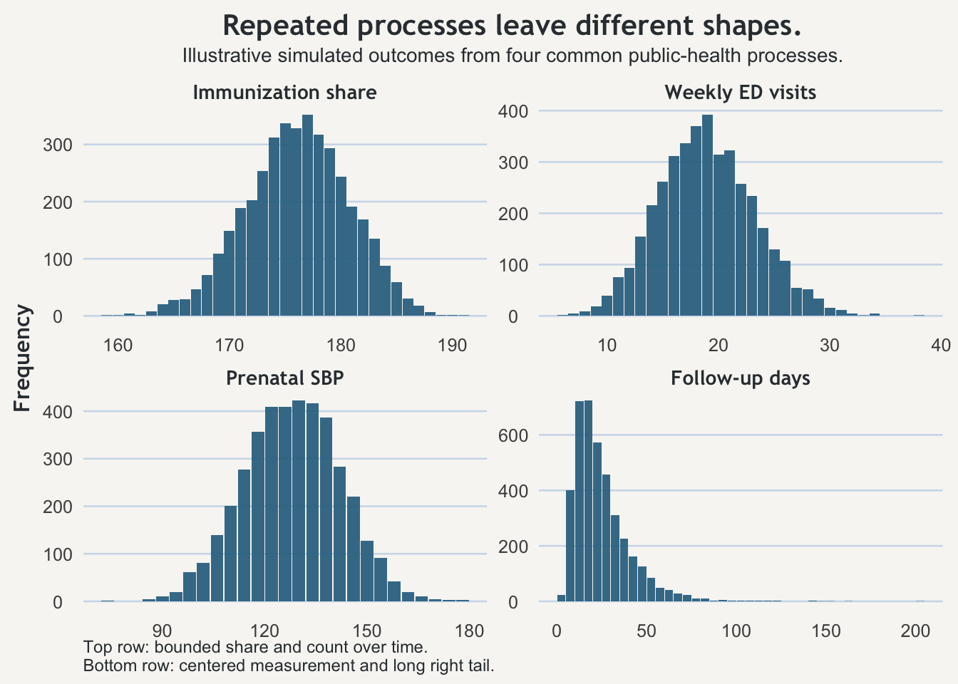
The top row contrasts a bounded share with a count over time. The bottom row contrasts a measurement that gathers around a middle with a delay process that stretches into a long right tail. All four come from repetition. They just do not leave behind the same visual record.
A count over time
Now take the weekly overdose-related emergency department visits. Suppose the county records 19 visits this week. That may be bad news. It may deserve action. But it behaves differently from 176 of 200 because it is not built out of a fixed pool in the same way. It accumulates through time.
Some weeks are simply busier than others. Weather changes. Benefits hit. Supply changes. Holidays interrupt routines. Transportation fails. Random clustering happens. A weekly count can therefore look dramatic before it means anything dramatic.
That does not make the count trivial. It makes interpretation more disciplined. A jump from 12 to 19 may be the beginning of a real surge. It may also be the kind of week that appears now and then even when the background process is broadly similar. The right habit is not indifference. It is refusing to confuse a busy week with a full explanation.
Measurements around a middle
Blood pressure asks a different question again. Each first prenatal visit produces a measurement on a continuous scale. Collect enough of those readings and they usually gather around some middle with spread on both sides.
That changes what counts as ordinary surprise. A value of 151 mmHg matters for the patient in front of you. It may call for immediate clinical attention. But the existence of a 151 does not, by itself, prove that the county’s prenatal population shifted. Individual concern and population pattern are different judgments, and they should stay different.
When measurements cluster around a middle, interpretation has to hold more than one thing at once. Where is the center? How wide is the spread? Are the tails getting heavier? Is the middle drifting, or are a few extreme values simply pulling attention outward? A measurement process can therefore look calm in one sense and clinically urgent in another.
A long right tail is part of the process
The follow-up delays are different again. For each abnormal screening that eventually closes, the county records the number of days to completed follow-up. Most cases may move through in a fairly ordinary amount of time. Then a smaller number get caught in referral bottlenecks, transportation problems, language barriers, missed calls, childcare conflicts, insurance delays, or systems that fail unevenly.
That is why delay variables so often stretch out to the right. A few very long waits are not automatically signs that the data are dirty or that the summary is broken. They may be part of what the process ordinarily produces. That does not make them acceptable. It means the ugliness belongs to the process rather than arriving from nowhere.
This is also why medians so often become useful here. When a minority of long waits can drag the mean upward, the median often gives a cleaner first picture of the typical case. The mean still matters for burden and planning. But a process with a long right tail changes what “typical” and “extreme” look like, and a reader who expects symmetry will keep misreading it.
The names come later
Once the shapes are visible, the usual names become easier to place. Shares out of a fixed whole often invite binomial thinking. Counts over time often begin with Poisson-style thinking. Measurements around a middle are where normal-style thinking becomes useful. Positive outcomes with a long upper tail often push you toward lognormal, gamma, and other skewed families.
But the names are not the first thing worth remembering. The first thing worth remembering is simpler: repeated processes do not all leave behind the same kind of pattern. If you read every jump as though it came from the same statistical world, you will keep being pushed around by the wrong kind of surprise.
A share, a count, a measurement, and a delay are not the same kind of object. They should not be expected to vary in the same way.
Takeaway
Probability asks what might happen this time. A distribution shows what that same kind of chance looks like when it keeps happening. The single play can be vivid. The repeated process is what wins the season. Public-health numbers work the same way. Before you let one ugly value turn into a story, ask what kind of repeated process produced it and what kind of pattern that process ordinarily leaves behind.